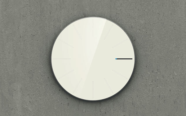
The concept of the Obligatory Designer Clock is fairly simple. Instead of cluttering up the clock-face with time markers, digits, numerals, hour and minute hands, designer Saikat Biswas decided to clean it all up with a simple one mark interface. As Biswas describes of the timetelling: “For example at 3 o’clock the 3rd hour marking becomes dark and then a colored bar starts growing within the 3rd marking at every minute until the 59th minute. Then the 4 o’clock marking become fully dark and the same process continues. Even though it looks unique and has kind of ‘digital’ look and feel because of the growing bar, it uses exactly same mechanism as a normal clock.” I love the clean and elegant design, the only problem I can see is trying to decipher how dark the bar is from anything more than 10 feet away.
Watch the video below to see Saikat Biswas’ Obligatory Designer Clock in action…
Obligatory Designer Clock from Saikat Biswas on Vimeo.


[…] [via Lost In A Supermarket] […]