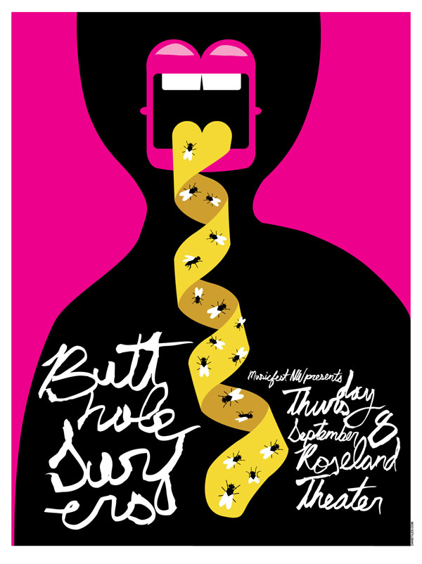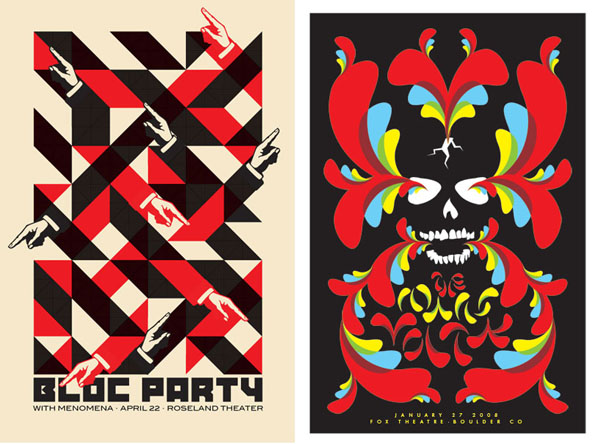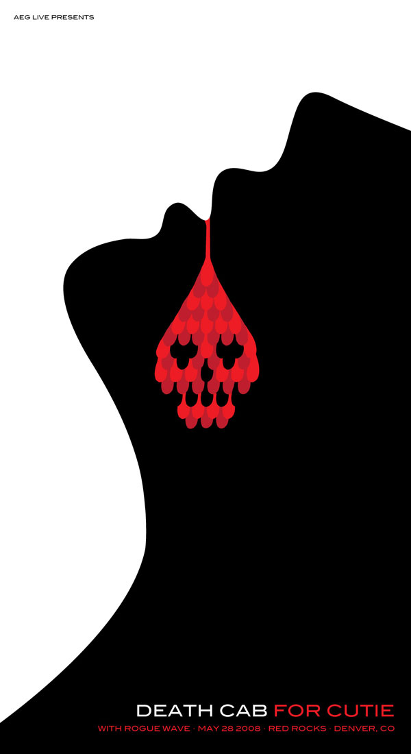
We’re starting a new series highlighting a genre of art that has long been held dear to my heart: rock posters. For the inaugural edition of Rock (Poster Art) Gods! we’re kicking things off with Dan Stiles, a 15+ year veteran laying it down from his studio in sunny Portland, Oregon. We loved Dan’s interview, so no need to do anything else but get to the wisdom and peruse his substantial rock poster art. Enjoy!
So did you begin your “rock poster” illustration career in grammar school, diligently doodling band logos to exact standards?
In grammar school I was busy copying X-men comics, Bloom County strips, and type sheets my mom used to get from the local print shop. However in 8th grade I discovered punk and was captured not only by the music but also by the artwork and culture that came with it. I would meticulously copy all the band logos. Many of which are still my favorites. The Misfits type as well as the fiend, The Dead Kennedys, Black Flag, The Circle Jerks, The Exploited. So many great logos. I was never into Maiden, but Eddie ruled as well. Jim Phillips and Pushead also provided a lot of with their skate decks.
X-Men ruled my world as a kid, I collected all the way back till #94 or whatever it was when the New X-Men took over. Who was your favorite X-Men artist? And is there one particular image/cover that rocked your world?
I’ll give you a super geek answer and say my favorite X-Men cover isn’t an X-Men cover. It’s Wolverine #17 by John Byrne. The bright red one where he’s charging right at you. [See it in gallery after Jump – MM]
To me it begins and ends with Byrne when it comes to X-Men; there is no other. So how did you transition from illustrating to working with bands/artists? It seems like a very natural progression, but how exactly did yours take place?
I started collecting flyers early in high school. I would rip them off telephone poles and tape them up on my walls at home. They were three layers deep. However it never dawned on me to make posters until college. I lived in this big house and I used to wander around late at night with a handful of markers and draw on the walls. One of my housemates asked if I wanted to do posters for the campus promoter. He offered me $20 and all the beer I could drink, which was a deal I couldn’t refuse. That was around 1991 and there were so many great Seattle bands that came through town. Having moved to the Northwest to be closer to the music scene it was a dream come true.
Your style seems to be either full of patterns or have a very playful vibe — or both. I really dig the Melvins one where the guy is choking the chicken. Literally. What was the inspiration to that piece? And how do you decide whether to go humorous or aesthetic?
I always wanted to do a choking the chicken poster and when the Melvins called looking for a poster the idea finally found a home. Not many clients are going to sign off on a concept like that. But after Kleinsmith did the infamous “penis moon battle” poster for them I knew the Melvins would be game. I didn’t even show them any other ideas.
Hit the Jump to continue reading our Q&A with Dan Stiles with another gallery of his work…
“I mourn the loss of the true geek. Someone who worked for years to amass their arcane knowledge of punk rock, or Godzilla, or blaxploitation films, or whatever. Now everyone is an instant expert, everything is available at the push of a button…”
To this day, what has been the poster/illustration that has brought you the most personal satisfaction?
That’s a little like asking which one of your children is your favorite. There are ones that are more or less successful designs than others. There are some that sell better than others. But as a designer almost everything I do allows me with some level of growth. If something works, I learn from that, if something fails I learn from that too. Every once in a while you nail something, and that feels good, but then it’s back to feeling your way through. A hate a few of them for one reason or another, and I love a few others, but nothing is a single stand out favorite.
Has there been an artist that asked to work with you who you were a huge fan of before they asked? What was the circumstance, and how fulfilling was that experience for you? Or was it hell because of the pressure?
I’m familiar with most of the bands before I work with them. At least by name if nothing else. However the Sonic Youth poster was a real challenge. Those guys are legends. I did that poster 12 times before I came up with one that I liked. It was pretty painful, but in the end it’s one of my most recognized pieces.
You’re on deadline, with several posters to deliver by end of week. You’ve blocked off a whole night to work. What 3 albums do you cue up on your stereo to get amped and inspired?
I’m always listening to new music. My five favorite albums of all time probably only get listened to once or twice a year. I’m so familiar with them that there’s a fear of simply burning them out after 5, 10, 20 years. I’m always looking for new albums that make the hair on the back of my neck stand up, like the old favorites do.
Do you use iTunes/MP3s, or are you still a dedicated aficionado of vinyl? In a related question, do you mourn the demise of the vinyl album, and the associated de-valuation of album artwork along with it? Or do you feel digital media has maybe opened up new avenues for music and art to conflate which make up for the death of album art?
I mourn the loss of the true geek. Someone who worked for years to amass their arcane knowledge of punk rock, or Godzilla, or blaxploitation films, or whatever. Before the digital age it was hard work to be into underground stuff, because it was, well, underground. It took me two months and like $40 to get a copy of the Misfits Walk Among Us in high school. The first pressing was sold out and I had to import one from the UK. Luckily I grew up in a college town so we had a couple of real record stores not just the top 40 mall variety. I had to fill out a little slip, plunk down my cash, and hope and pray that the damn thing showed up eventually. Everything was like that. You wanted a pair of Doc Martins? You had to order them from the UK by mailing in a little form from the back of some punk magazine. With digital I could have downloaded the entire Misfits catalog in the time it just took me to write all that. Everyone is an instant expert, everything is available at the push of a button. It’s cool, but nothing stays underground for more than 30 minutes with that sort of ease of access. Of course the flipside is the rebirth of vinyl, the screen printed rock poster, indie crafts, knittivism, etc. People crave tangible artifacts, it’s in our monkey DNA. The album covers I did for BCwax are a direct result of that need for the physical object. The CEO over there loves that stuff. He hired me specifically to make some over the top objects. 180g colored vinyl, die cut sleeves, poster inserts with metallic inks, the works.
I’ve never heard that argument articulated quite like that — I’ve only heard of the benefits of all this information and accessibility, never the downside. Another negative aspect to me is that no one really needs to learn anything if they can find the answer to it on Google in 20 seconds. Yes everyone’s an expert, but in a way nobody knows shit. I used to be able to name every member of a band, their label, the year their albums came out and recite the lyrics verbatim. But I wonder if the superficiality of everyone’s mastery actually affects the depth of our appreciation of the music/art. I don’t wanna sound like Grandpa Backinmyday, but I don’t know if I fall in love with stuff as deeply as I did back then. And maybe that’s why… or maybe it’s because my soul has died inside.
People used to really have to give a shit about stuff. Getting into something was hard, it required dedication and practice and blind stupidity. Now everything is at your fingertips, which makes it easy to find, which in turn makes it worth less when you find it. The hunt is half the fun. Furthermore everything is easier to rip off. Take a little of this, a little of that, add a Star Wars reference, and poof, you’ve got some kind of pop art. I’m not saying that’s easy to do, but it’s sure as hell easier than giving birth to something that’s an original creation. While I know that nothing is truly original, there is so much stuff going on today that is either something old recontextualized or something new that is just something old done over again. Why bother making something new when, as Patton Oswald says, we’ve got “Everything That Ever Was – Available Forever” served up at the push of a button? Nothing is precious, it’s all just stuff floating in the ether, and maybe that’s just fine. But when I hear The Pixies I can’t say “oh, that’s just so and so done over again”. Sure you can hear the surf and post punk influences, but they don’t sound like a lost Dick Dale record. How many bands out there right now sound just like Gang of Four, or Joy Division, or The Cure?
But like I said, the positive side seems to be a new interest in the creation of real objects. In this world of slice and dice digital media the monkey part of us still wants to get his hands dirty.
What album from history would you like a chance to re-design the cover? This can be either because the art influenced you profoundly and is sacred to you, or because you feel the original work didn’t match the awesomeness of the music.
I never liked the cover for The Pixies Surfer Rosa. Although I would never want the pressure of redoing it. That album is so perfect. Who am I to question it?
Ok last question: if you were lost in a supermarket, in what aisle would we find you?
Buying a steak or sleeping on a couch in the home decor section at Fred Meyer.


