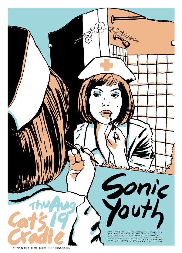
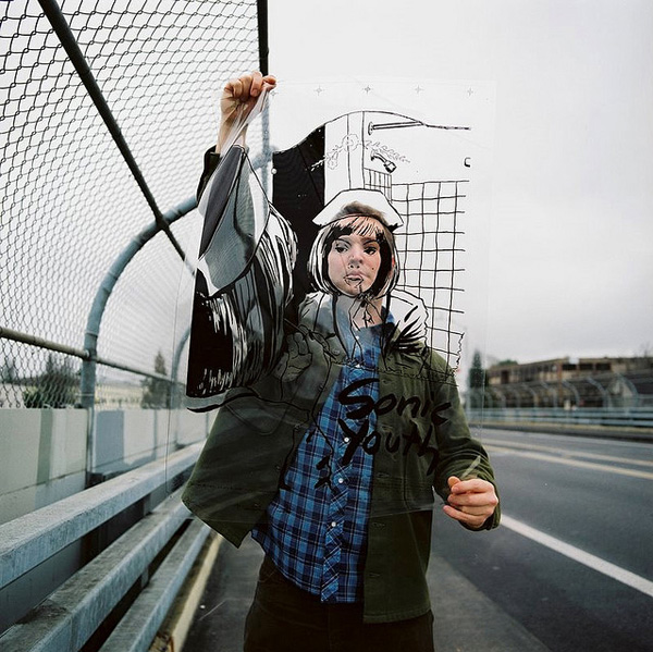
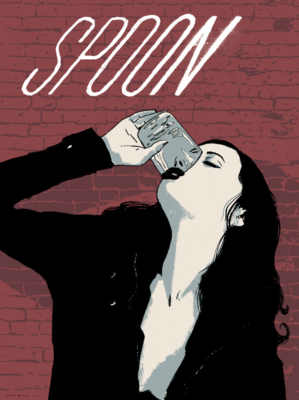
Couple weeks back we launched our new artist featured series Rock (Poster Art) Gods! with Dan Stiles, and now we continue with another top illustrator in his field Casey Burns. You might recognize the above poster for Sonic Youth, or one of his many excellently sexy/implicitly malevolent posters for Spoon — most of which feature “a good looking girl who may or may not have just done something horrible to a man,” as Burns himself would say. “Or maybe she just happened to be holding a wrench in the same room as a guy taking a nap on the floor.” Who’s to say, really? Anyway, Casey’s art is awesome and he waxes an excellent interview — in fact, rock poster artists are quickly becoming our favorite interview subjects. Read on to find out about his early years at U.N.C., his appreciation for the art of Raymond Pettibon, and the underlying nuances of femininity that make his singular art unique…
So did you begin your “rock poster” illustration career in grammar school, diligently doodling band logos to exact standards? If so, what bands’ logos were your favorite to perfect?
Throughout fourth and fifth grade, I was obsessed with Van Halen. They had such a great logo, and I used to draw it everywhere. I’d even draw it in 3D-style block letters when I was feeling ambitious. In fact, at summer camp I drew the logo easily 400 times on the wall next to my bunk in various sizes and styles. It was this big crazy clump of ballpoint pen Van Halen logos, and somehow I never got busted for that. The next year I was introduced to the Dead Kennedys by an older skateboarding friend down the street, and my world of music opened up from there. Lucky for me they also had a great logo, and I drew that all over my Converse All-Stars, my skateboard, my totally punk rock Trapper Keeper, and anything else I came across.
Hit the Jump to continue reading Rock (Poster Art) Gods! vol. 2, with artist Casey Burns, and if you like what you see feel free to follow us on Twitter/Facebook…
“I aim for less of a pure sexual fantasy and more of a reminder that the real women all around you are way hotter than any boob-job in a magazine could ever be…”
Photo above by Alicia Rose, all other images courtesy of Casey Burns
How did you transition from illustrating to working with bands & artists?
It was a pretty seamless transition for me. I was drawing all the time and self-publishing mini-comics and zines throughout high school. One of the few places that sold my wares was an all-ages music venue in Asheville, NC, called Squashpile. They had a little zine rack on the bar. One of the owners taught me how to screenprint shirts and how to release your own records, and it all followed from there.
I moved to Chapel Hill in 1993 to attend the University of North Carolina, a town that has more of a music scene than most major cities, due in large part to a very well-run club called Cat’s Cradle, which has been around for over 40 years now. I started working there when I turned 21, bartending, working the door, and doing occasional posters for bands that I liked.
Once I finished up my journalism degree, Frank Heath, owner of the Cradle, created a full-time art and design position for me at the club. I put together the club’s first real website, designed ads for the local weeklies, all the tickets for shows, flyers for every show Frank booked at the Cradle and other venues in the area, and screenprinted posters for big-ticket shows.
My drawing and printing skills improved quite a bit over the years I spent at the Cradle, and eventually my work began appearing in coffee table books about posters like The Art of Modern Rock. That’s when art directors from all over started tracking me down to make their projects look as legit as my posters. I’ve since done work for Nike, The New York Times, Deschutes Brewery, Modest Mouse, and all kinds of dream clients. Every project has been a lot of fun so far.
Your style has a very implicit sexiness to it — not exactly erotic, but you seem to have a great eye for female nuances. Can you place your skill? Like are you just a Crumb-like perv, did you grow up in household of women and know their intricacies?
Many of the things I find attractive about women are about two steps to the left of what most guys tune into, but pretty close to what women find attractive in themselves and each other. I figured this all out after realizing that way more women were buying my work than men. I like confident women who don’t give a damn. I like knowing glances from across the room. I like women with good taste in clothes, even though I dress myself in the same boring black t-shirt and jeans every day. I am attracted to a lot of mundane moments and actions, and these are the situations I like to draw. Some guys I know have told me they love the women in my drawings, but they would be afraid of them in real life. Girls love that shit.
The key to making these attitudes come across in a drawing is getting the facial expressions and body language right. If it’s too exaggerated, it comes across like cheesy pinup art. I am a big fan of some of that, but in my work, things have to be more subtle. I aim for less of a pure sexual fantasy and more of a reminder that the real women all around you are way hotter than any boob-job in a magazine could ever be.
To this day, what has been the illustration that has brought you the most personal satisfaction?
It’s a tie between my 2004 Sonic Youth poster with the nurse on it (at top) and my 2009 poster for Spoon and Jay Reatard.
The Sonic Youth one was huge for me simply because it was the best poster I had ever done at that point, and for a band that had a huge impact on me from an early age. That poster is striking, sexy without being stupid, and fit perfectly with Sonic Youth’s current and previous aesthetics. It riffs off their 2004 album Sonic Nurse, and the paintings by Richard Prince that adorn its covers. Aesthetically it also has a hint of the work of Raymond Pettibon, who did a lot of early work for the band, notably the cover of 1990’s Goo.
Speaking of Pettibon, this reminds me of a funny aside. Funny to me, anyway. Ten years ago I designed a font based on the Leroy stencil lettering that was used in the EC comics of the 50s. You know, Tales From the Crypt, Weird Science. I posted the font online, and Coop, the famous poster artist, emailed me to get a copy of it to use in one of his books. He took a look at my poster work, and said he liked it because it reminded him of “Raymond Pettibon if he could draw better.” I may be paraphrasing, because I don’t still have that email from years ago, but that was the gist of it. And I took that as a huge compliment. Mind you, I wouldn’t change a thing about Pettibon. I love his work exactly the way it is. There’s so much absurd humor in it. That’s the kind of stuff that always cracks me up. And I like to put a good deal of humor in my work, even if it may be really subtle.
Speaking of absurd, I went through an absurd and brief marriage and divorce between 2005 and 2006. I won’t get too deep into it, but the bottom line is I married the wrong girl, and then fought over a house and some wedding gifts for a year. I’ll get back to this in a moment.
“Many of the things I find attractive about women are about two steps to the left of what most guys tune into, but pretty close to what women find attractive in themselves and each other…”
Anyway, that Sonic Youth poster went over really well with the band and fans of both their music and my art. It has appeared in magazines, three or four books on poster art, and a German calendar. It is also part of the retrospective exhibition that is still touring museums in Europe, Sonic Youth etc: Sensational Fix. I even designed a vinyl toy based on the nurse. That girl has gone the distance.
This leads us to the other winner in this tie. The poster I did for Spoon’s New Year’s Eve show at the end of 2009 has a hilarious narrative, is well composed, and takes full advantage of some sneaky overprinting techniques to create that cool grey color that isn’t really there. I’m very proud of this one.
This poster works well for the band. Themes of romance, tension, and clashing of the sexes are all over Britt Daniel’s songwriting. A drawing of a guy working on his car while being approached by a girl holding a baseball bat at her side is fitting for Spoon in a sort of understated pulp noir throwback way. And if you look a little closer, you can see that just out of the girl’s line of sight, the guy is reaching for a pistol. It’s a play on the old “don’t bring a knife to a gunfight” adage. This one is a winner. I also refer to this poster as “Divorce Illustrated.”
“Divorce Illustrated” — bet your ex loves that! So how exactly did you end up working with Spoon — did they approach you? Are they a big inspiration for you?
I had been a fan of Spoon for over ten years, and they got in touch with me out of the blue after coming across my work somewhere. That was pretty exciting, because they are a band that just keeps getting better. They’re the best pop band in America if you ask me. That is, unless the Glands put out a new record. Then Spoon’s in trouble. But yeah, huge fan of Spoon, so I wanted to give them my best. They were extremely easy to work with, and loved everything I did for them. I don’t remember having to change or revise any of my concepts in the slightest.
My first piece for them was the poster I described earlier, and I followed with a series of four or five more posters and a shirt design that could be seen as either sexy, funny or scary, depending on your point of view. Most of them featured a good looking girl who may or may not have just done something horrible to a man. Or maybe she just happened to be holding a wrench in the same room as a guy taking a nap on the floor. Really it’s the viewer making these horrible things happen, because I’m not showing very much information. It was a fun exercise in illustrating implied violence.
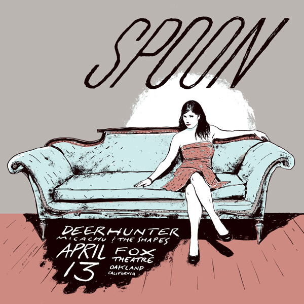
My favorite of the series may be the last one I did, for a show in Oakland. A beautiful girl sits on a vintage couch, with her hand on the cushion next to her, asking the viewer to take a seat next to her. Meanwhile, all that’s left of the last person that sat next to her is a massive dark pool of blood seeping from under the couch, informing you that Deerhunter is opening the show. Or maybe it’s just a wine stain. Your call.
Perhaps Casey Burns’ favorite Females of Implied Menace series for Spoon below…
You’re on deadline, with several posters to deliver by end of week. You’ve blocked off a whole night to work. What 3 albums do you cue up on your stereo to get amped and inspired?
Wire’s Pink Flag, Neu! 75, and Archers of Loaf Vs. The Greatest of All Time. I could put those three records on repeat for days and be perfectly content.
Do you use iTunes/MP3s, or are you still a dedicated aficionado of vinyl? In a related question, do you mourn the demise of the vinyl album, and the associated de-valuation of album artwork along with it? Or do you feel digital media has maybe opened up new avenues of music and art conflating which make up for the death of album art?
I listen to MP3s all the time, but I’m still a big fan of vinyl. CDs are trash, as far as I am concerned. Just a temporary place to hold music until it lives on your hard drive. Right now I’m witnessing the demise of the CD, and good riddance. Steve Albini and Big Black were correct in calling them “the rich man’s eight-track tape” many years ago. Vinyl is on the rise again, at least in my circles. I’ve been designing more 12” and 7” sleeves in the last two years than I ever did in the past, and all of the vinyl projects I’ve worked on include download codes for the music, so all bases are covered.
I recently completed the single coolest design project of my life. A box set for Three Lobed Recordings, a small label out of North Carolina. The set consists of a full color box, four 12” LPs with color sleeves, liner notes, and a bonus 7”. Eleven bands, including Sonic Youth, Bardo Pond, and Sun City Girls, split the sides of the records. I designed the whole package and did a series of paintings and drawings for every side of each sleeve. The entire pressing sold out immediately and got rave reviews from NPR and Pitchfork.
It was great to be able to tackle such a great project, and to see it received so well and to sell out so fast tells me that more and more kick-ass vinyl and accompanying packaging will be in the public eye from now on.
What album from history would you like a chance to re-design the cover? This can be either because the art influenced you profoundly and is sacred to you, or because you feel the original work didn’t match the awesomeness of the music.
The Pixies’ Surfer Rosa. That record and its cover are perfect, and I had a huge poster of it on my wall as a teenager. I would love to do a painting based on that photograph and see it used on a special edition of that album. Of course, I could never improve on the original cover, but it sure would be fun to try.
Ok last question: if you were lost in a supermarket, in what aisle would we find you?
I’m still trying to find the perfect frozen pizza. Hasn’t happened yet.


Hello. I see that you don’t update your website too often. I know that writing content is time consuming and boring.
But did you know that there is a tool that allows you to create
new posts using existing content (from article directories or other blogs from your niche)?
And it does it very well. The new articles are unique and pass
the copyscape test. You should try miftolo’s tools
I see you don’t monetize your blog, don’t waste your traffic, you can earn extra cash every month.
You can use the best adsense alternative for any type
of website (they approve all websites), for more details simply search in gooogle: boorfe’s tips monetize your
website
lostinasupermarket.com is interesting, i will come back here for sure