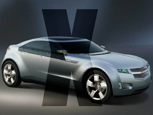
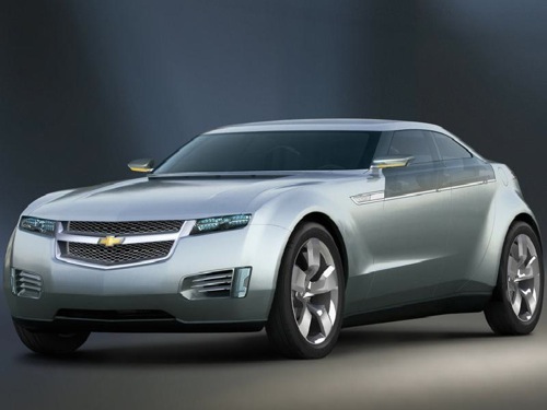
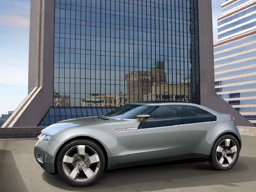
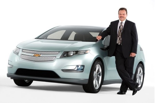
In what is surely the automotive shock of the year, GM has completely dropped the ball on their most promising car of the future. Instead of the aggressively lined, low-slung beast above as the design for their heavily hyped Volt, the boys behind some of the ugliest cars in the world instead have opted with the atrocity you see below. Shocker, I know. Why didn’t they just take a Prius (already hideous on its own) and just stick a Chevy badge on it? Would’ve saved them millions in development.
Credit Car Connection with landing these early pics, but does it really matter? When you’ve created something this bland, does it matter if the pics came out a year early?
More pics of What Is and What Could’ve Been after the Jump
What Once Was…
What unfortunately Now Is…


